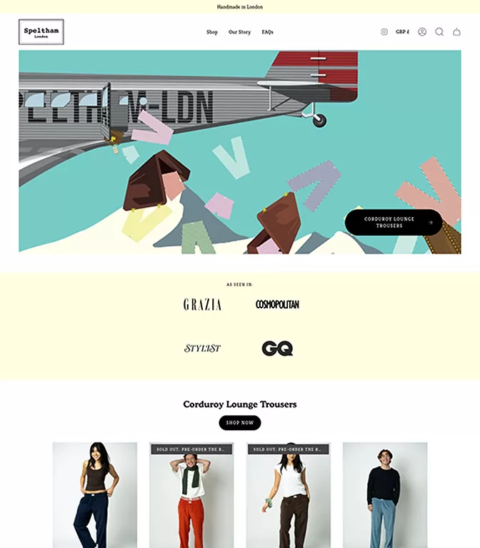
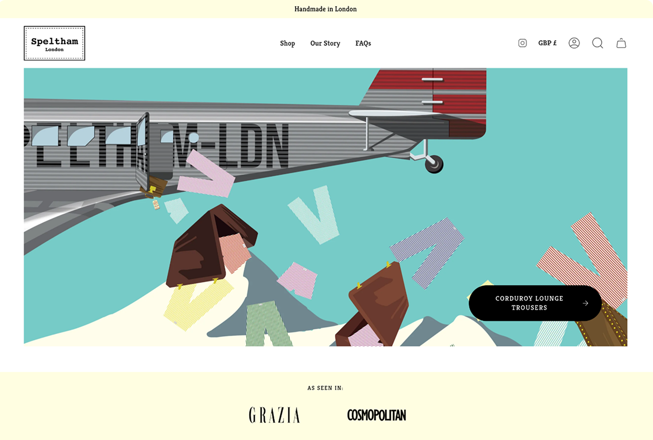
The visual design of an e-commerce store is a funny thing because people are less concerned with how an online store looks, rather how it feels and works. The design is, however, a significant factor in this.
Take, for example, how difficult or easy a store is to navigate. The visual elements are fundamental when ensuring an effective, and positive, experience for the customers that visit the site.
The customer experience is (or at least should be) at the forefront of every element of your business, from marketing to design, because quite simply, you wouldn’t exist without your buyers. So doing all you can to ensure they come back is a top priority.
To help, we’ve put together some of the most important visual design elements for a modern e-commerce store, not all of which are strictly visual. Read on to ensure that your online store keeps those customers coming through the digital door.
The visual visuals
So we mentioned at the start that not all of the visual design elements of your site stay visual. They work to evoke emotions and design also relates to how something works. However, there is also a purely visual side to it all as well, so let’s get that out the way first.
The perception of your products online is crucial to how well they sell. First impressions online are disgustingly quick. Image quality via things like product photography is vital because it’s the only thing your customer has to go by. The physical “in store” aspect is gone; there is no touch or taste, so a static visual is the primary driver of their decision.
Product photos work best on a white background, or, if applicable, in use. The white background makes it easier for consumers to see the details of the item. To help with this, there are plenty of free online courses that focus on product photography so you can inexpensively take your own shots. The “in use” lifestyle photo serves as an explanation; they let people see how the product would be used in day-to-day life.
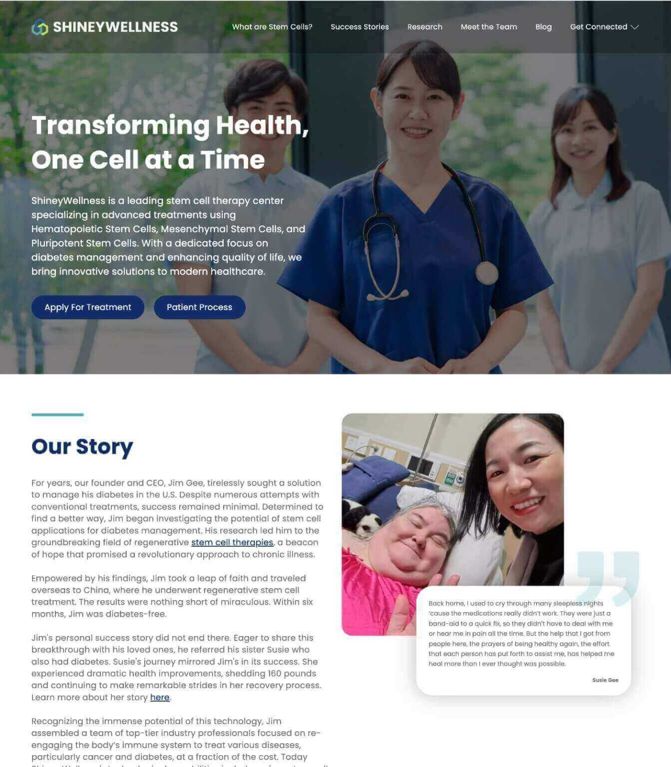
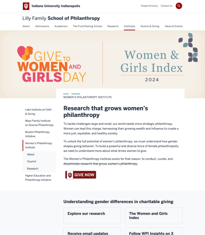
Another visual element that works in conjunction with fantastic product photography is color and font. The aesthetics of your website need to be cohesive, inviting and professional. The overall experience of buying a product is profoundly affected by all of these things; they need to create a sense of trust and quality.
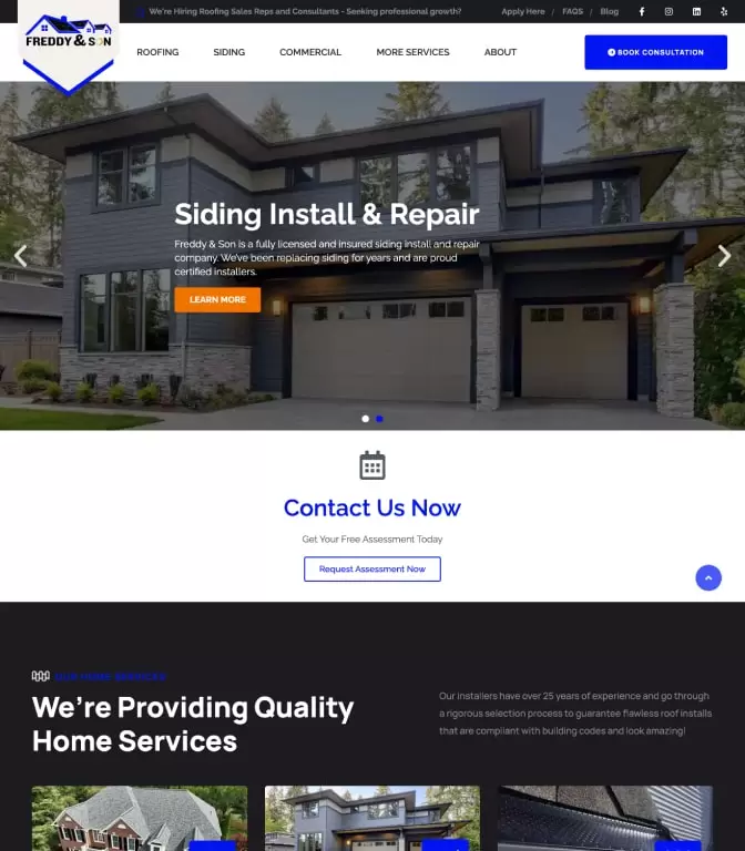
Color is also a great way to draw attention to critical areas of your website, specifically a call-to-action or whatever step of the buyer’s journey is next. Keeping it simple and easy-to-understand is the best way to go, so to achieve this, stick to two main colors, a primary color and secondary. You will want to also consider your branding in all of this as the colors should match the personality and theme of your business as a whole.
The color and font should be easy to read, it’s ok to get a bit creative and artistic, but you don’t want to distract from the process of shopping. Things need to be as easy as possible for the buyer, or they will get fed up and move on. This means your typography should be dynamic and interesting, able to communicate emotion, but very simple to understand.
Choose two fonts to keep things simple, one as a header or title and another as the body. The body font should be the easiest to read, while your header can be a little bit more creative to attract attention.
The importance of good formatting
Mobile devices are rapidly becoming the primary way that people search online, and shop. A lot of e-commerce websites are yet to catch up to this. Designing for desktop only will no longer cut it, and you will absolutely lose sales.
For this reason, your e-commerce design needs to be responsive, so it can adapt to various devices and screen sizes to account for smartphone and tablet use.
The purchasing process needs to have an excellent transactional flow for sections such as cart drawers on mobile navigation. The mobile navigation needs to assist your customers in selecting a purchasing your products in a quick and straightforward manner. The online shopping experience is helped by good navigation which means you’ll see a boost in sales. You need to consider this when choosing your theme, especially if you have a lot of products and require things like a bigger menu.
When designing your store only feature a small number of menu headers in your navigation, for example:
- Store
- About Us
- Top products
- Contact Us
Over time you can add to or change these based on the behaviour of your users, which you should be monitoring regularly.
Design trends
Trends will come and go, but at the moment, there are some staple trends that have been on e-commerce sites for a while and seem to be having a positive effect.
Animations
Rich animations and GIFs capture attention, communicate emotion and engage the customer while also adding movement to the visuals in your pages. Use this for homepage banners and background images for the best results.
Cinemagraphs, which are still pictures with a small animation which looks like a video are also another great way to grab attention.
Content focussed design
Also known as material design, this modern and vibrant style works to the very popular minimalist trend. Basically, shadow effects create motion and depth, coupled with clean interfaces that create a sense of realism. This is successful because it also simplifies the experience for the buyer.
Hamburger menus
An oldy but a goody, hamburger menus are common in the framework Bootstrap 3 Navbar and have one small tweak of late; it is better to put the menu on the left side of the navigation as opposed to the traditional right side. This does a better job of grabbing attention and has even been adopted by Google.
Long pages
It is better for your pages to be bigger than to create extra clicks for your user. Long scrolls are the way to go on your ecommerce sites. This creates a better user experience as the buyer feels like they are seeing more products without having to load a new page.
Product descriptions
The product descriptions on your ecommerce site need to be succinct, relevant and useful while explaining the benefits of the product as well as the features. It is worth considering the hiring of a professional copywriter to ensure that your words are effective, to the point and compelling. This text is acting as a salesperson after all.
They also need to be easy to read. Potential buyers want to learn about how the product is going to solve their problems and make their life easier. The product descriptions are the best way to convey this information and really show the value of your products.
The checkout process
Let’s finish things off with the most important element of your ecommerce website. The checkout experience needs to be the easiest step for your buyers. They are already thinking about the money they are parting with at this point, don’t give them any reasons to stop.
Adding items to a shopping cart and moving to the checkout page should be easy and very simple to understand. The exact contents of the shopping cart should be very easy to view at all times.
To do this correctly, use a clean and straightforward design and always include a guest checkout option. The form-filling should be simple. Don’t ask for any more information than you need and be sure to offer multiple payment options and a cart summary.
You can optimize your checkout page to make sure that it runs quickly as long load times are just more seconds where the buyer can reconsider.
A good looking E-commerce website
The main two takeaways from all of this are that your ecommerce website should be visually attractive while providing a hassle-free shopping experience for the user. The more comfortable people feel on your site, the better chance they will actually buy something, as well as come back to do it again. This is the goal.
The more you engage your visitors, the more encourages they will be to make a purchase. Be sure to consider some SEO elements so that all of this content, and it is content, isn’t going to waste and always tweak. You should constantly be monitoring and analyzing your online content to see what is and isn’t working so you can make the necessary changes and improve.
None of this stuff is set and forget. While it may seem like a lot of work, you’ll be glad that you invested the time when those sales start rolling in. You also don’t really have a choice because if you are not doing it, one of your competitors likely is, which means they will be advancing at a rate greater than you, and acquiring more business that could be yours. Happy selling!
Author Bio
James Silverwood is a digital marketing manager working with Perpetual Strategic Services which is the fastest growing Web Design Company in Riyadh. He helps clients grow their web visibility through all aspects of digital marketing.


